Research Projects
The Center for Collective Learning is a multidisciplinary research laboratory focused on understanding the growth, accumulation, and value of socially embedded knowledge. For decades, our team has contributed to understanding patterns of economic diversification, growth, and development. We also have new areas of research focused on digital democracy and people’s perception of technology.
Economic Complexity

For decades, economics has relied on the use of statistics as its battle-horse for empirical analysis. Today, machine learning tools, from recommender systems to dimensionality reduction techniques, provide a new way to understand economic development.
During the last decade, the field of economic complexity emerged as an important quantitative tool for the understanding of economic geography, development, and innovation. Indicators, such as the Economic Complexity Index (ECI), have become popular statistics of the economic capacities of locations, and concepts such as relatedness, have helped improve our understanding of the diversification paths undertaken by national and regional economies.
The Center for Collective Learning works on the development and application of machine learning techniques applied to economic development. Building on our vast experience on the fields of economic complexity, economic development, and economic geography, we provide a new predictive lens to understand the evolution of economies, from cities to nations.

The Observatory of Economic Complexity (OEC) (2011) makes more than fifty years of international trade data available through dozens of millions of interactive visualizations. It is the world’s most popular site to visualize international trade data.
The OEC was developed by Alexander Simoes as part of his requirement to complete his Masters in Media, Arts, and Sciences.

DataViva (2013) made available data for the entire economy of Brazil, including exports and imports for each municipality and product, and occupation data for every municipality, industry, and occupation.
DataViva was created in a collaboration between FapeMIG, DataWheel, and the Macro Connections group at the MIT Media Lab.

DataChile (2018) integrates, distributes, and visualizes data from more than a dozen different official public sources. DataChile was constructed by Datawheel with the support of Antofagasta Minerals, Corfo, Chile's Ministry of Economy, and Entel.
Digital Democracy
Can digital technologies augment democracy?
At the Center for Collective Learning we design, test, and develop tools to support civic participation. Our team consists of talented engineers, lawyers, scientists, and designers, experienced in the design, testing, and development of digital tools.
Our contributions include the creation of collaborative government program generators, which we have tested experimentally in France and Brazil, and modular constitution builders, such as Constitutin, which allow citizens to create personalized and collective constitutions.


We are interested in exploring new user interfaces and paradigms of participation, that help augment deliberation and collaboration among politically distant groups. We are also interested in participation paradigms that can increase the fluidity of the boundaries of participation. This includes non-binding digital forms of participation for non-citizen residents (from international scholars to refugees).
Our work builds on our vast experience in the design and implementation of complex online platforms. This expertise allows us to take an active approach to research on digital democracy, where we can learn through the design, implementation, and deployment, of digital platforms. Using on the ground, and controlled experiments, we are helping develop a solid understanding of how digital tools can augment and support the ideals of democracy.
Augmented Democracy (2018) is the idea of augmenting the participatory and decision making capacities of people by providing them with a digital twin. Here, you can get a gist of the idea on augmented democracy.
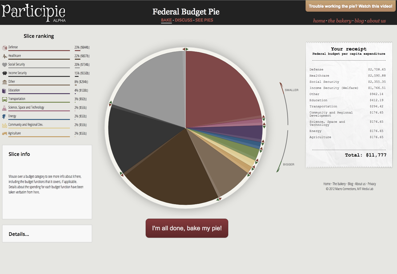
Participie (2012) was a design experiment on direct participation with constrained choices (like budgets). Participie was developed by Ali Almossawi as part of an independent study class.
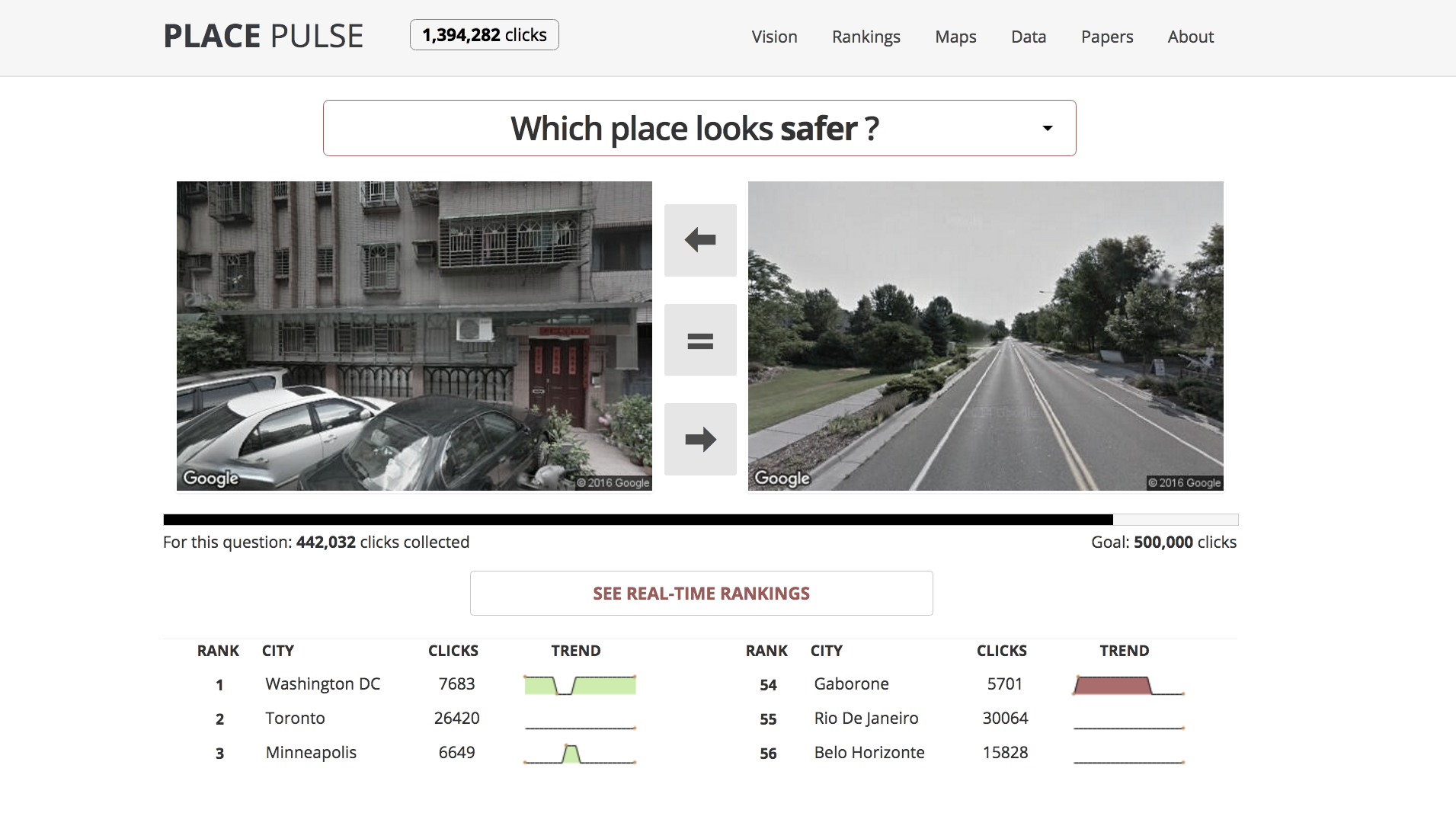
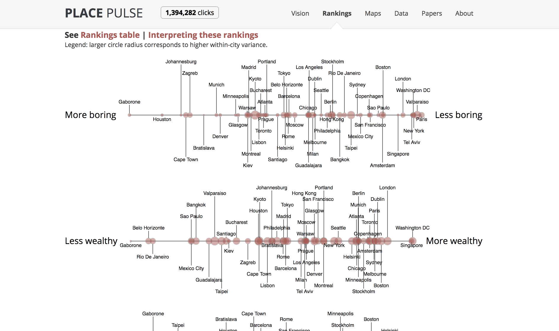
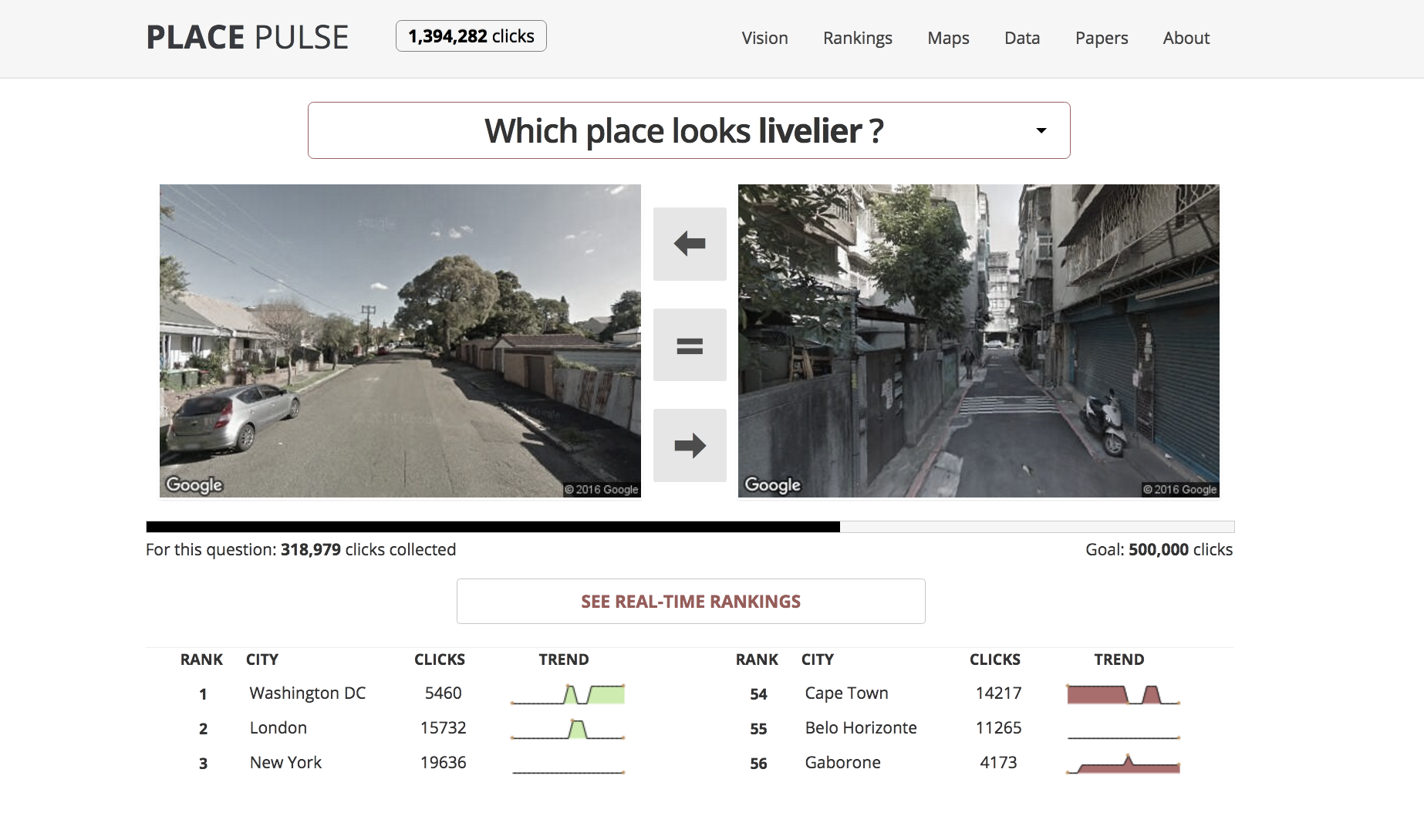
Place Pulse (2011) is a crowdsourcing effort to map urban perception. By asking users to select images from a pair, Place Pulse collects the data needed to evaluate people's perceptions of urban environments. This data is also the data used to train Streetscore.
Place Pulse was developed by Phil Salesses as part of his requirement to complete his master thesis. The present version of Place Pulse was re-engineered by Daniel Smilkov and Deepak Jagdish.
Networks and visualization
How does your social network changes overtime? What makes a language truly global? What shapes our collective memory as a species? Many of our previous research focused on such questions, but it all came down to one common phrase: connections.

Pantheon (2013) is an effort to map our species collective memory by structuring data on the biographies of globally famous indivdiuals. Pantheon 1.0 was developed by Amy Yu, in collaboration with Kevin Hu and Shahar Ronen.


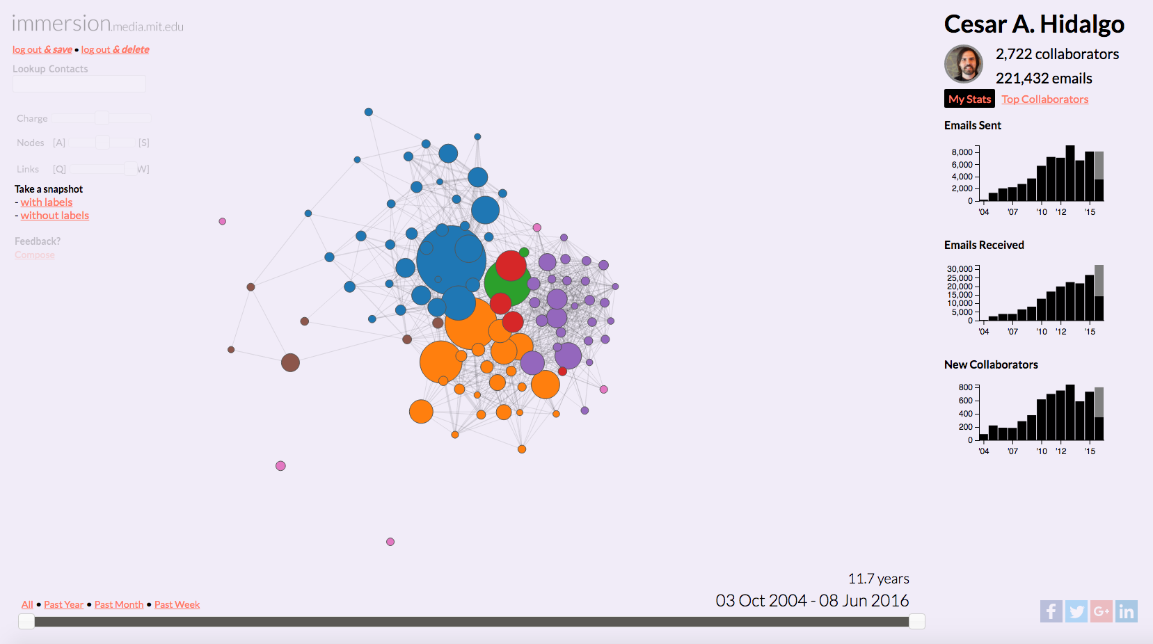
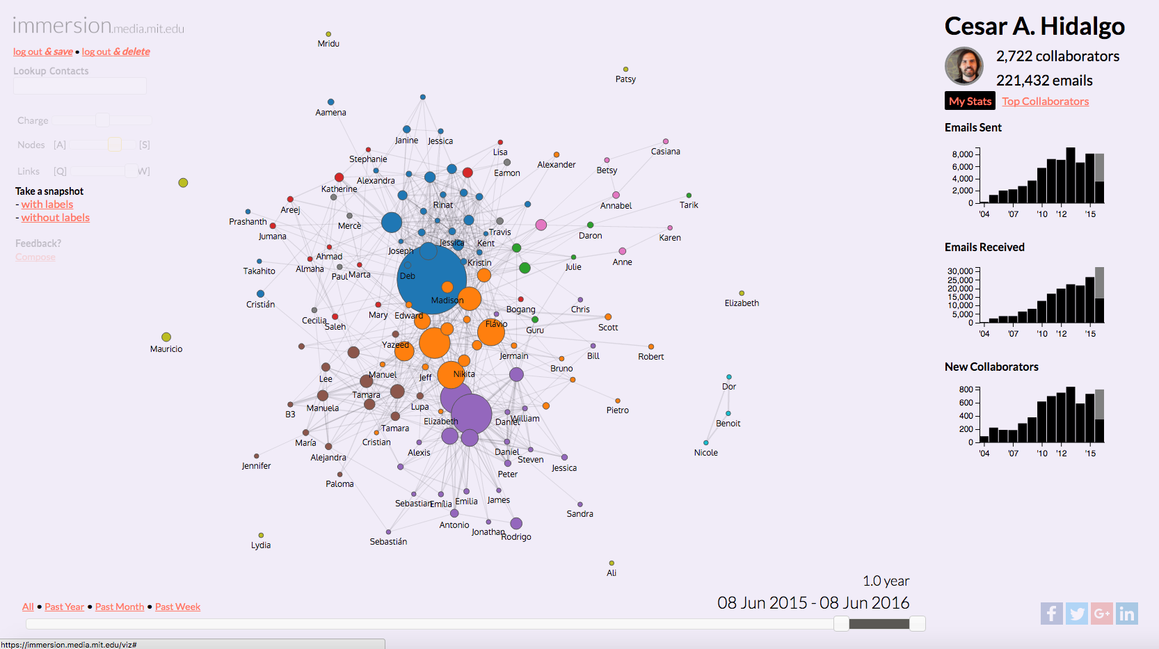
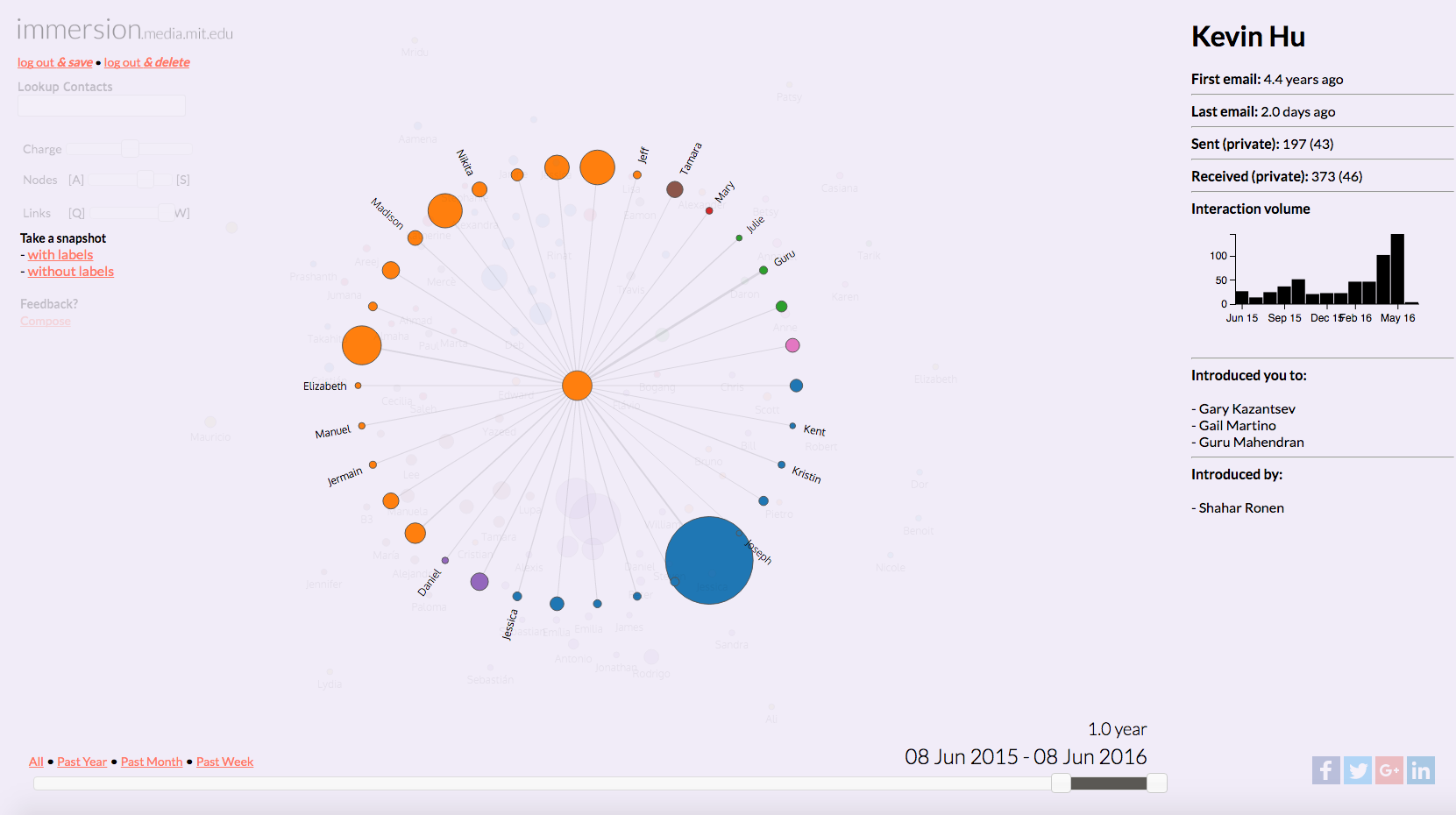
Immersion (2013) The current interface of emails is designed around time, and messages, pushing people to focus on what is more recent rather than important. Immersion is a design experiment that centers the email interface on people and the networks that people form.
Immersion was developed by Daniel Smilkov and Deepak Jagdish as part of their requirement for a Masters in Media, Arts, and Sciences.
Global Language Network (2013) is a project that uses the structure of the networks connecting multilingual speakers and translated texts, as expressed in book translations, multiple language editions of Wikipedia, and Twitter, to provide a concept of language importance that goes beyond simple economic or demographic measures.
Global Language Network (paper) was written by Shahar Ronen, Bruno Gonçalves, Kevin Z. Hu, Alessandro Vespignani, Steven Pinker, and César A. Hidalgo.
Shout! (2016) Can I borrow your network? Shout! is a marketplace for retweets that allows people to exchange micro-contracts for future retweets. Shout! facilitates the coordination of social media diffusion efforts by groups.
Shout! was created together with Ambika Krishnamachar as part of her requirement for a Master's of Engineering.
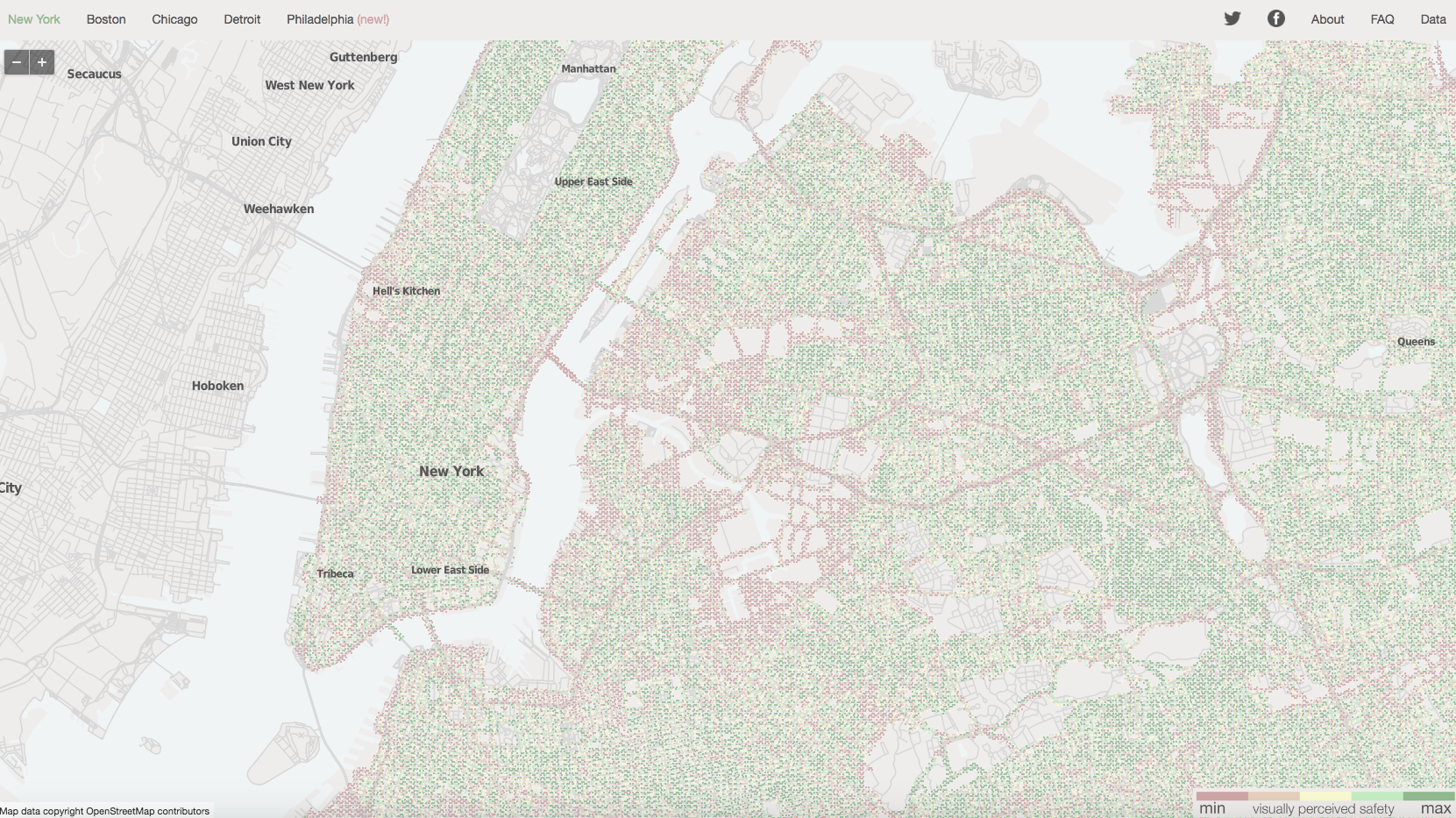
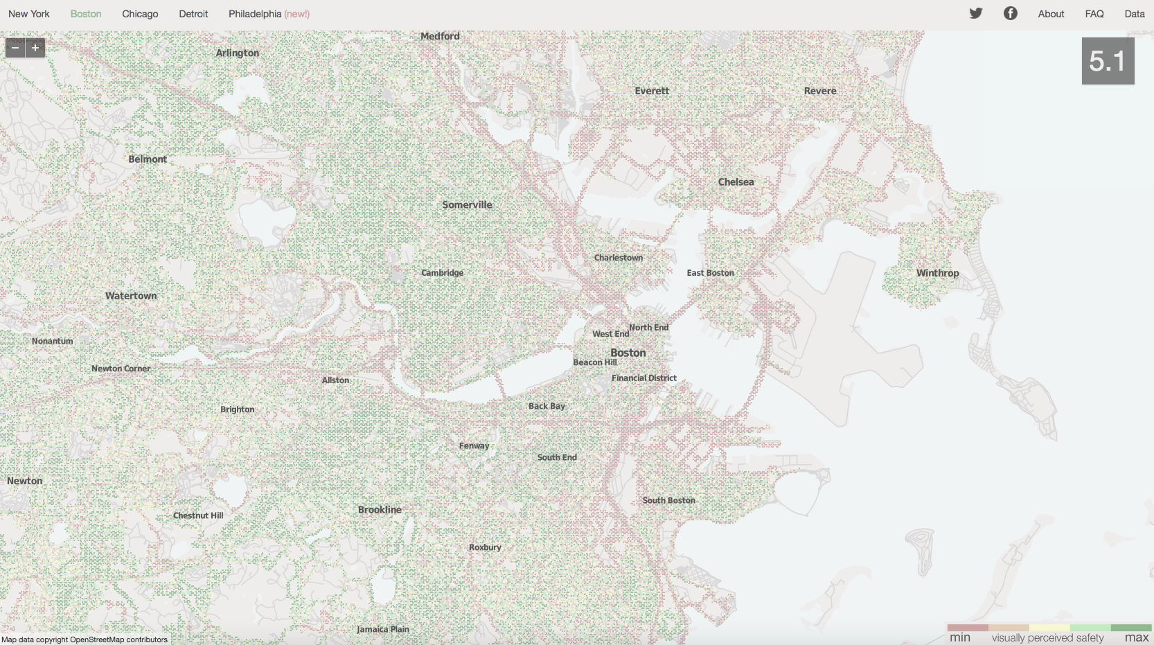
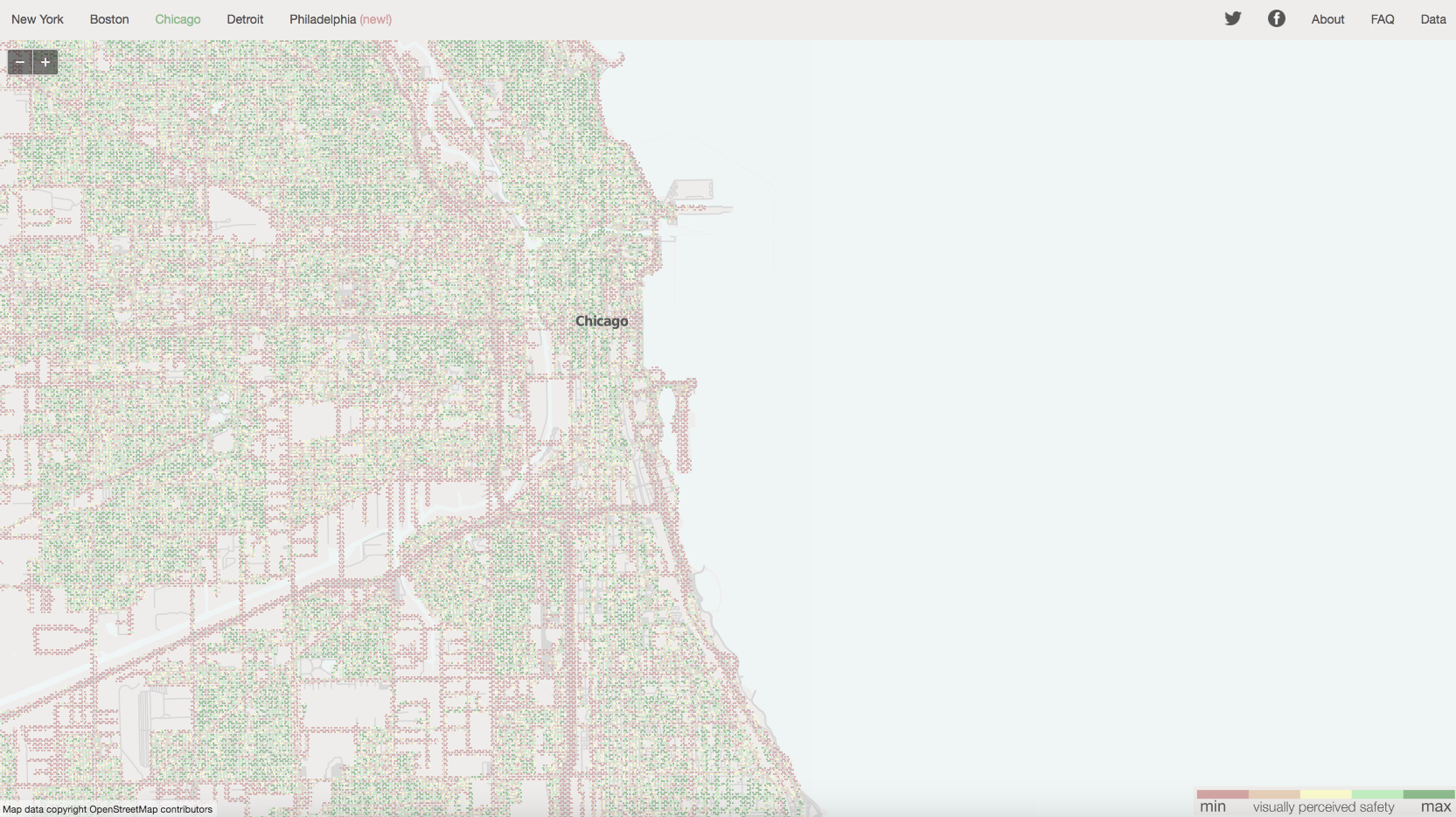
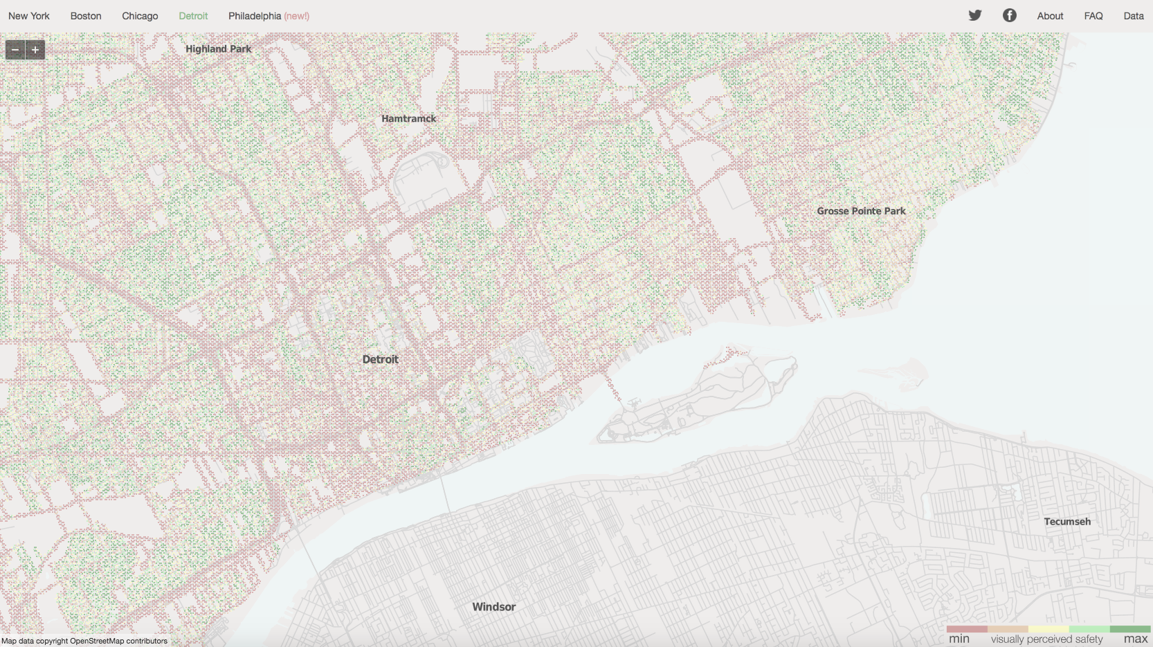
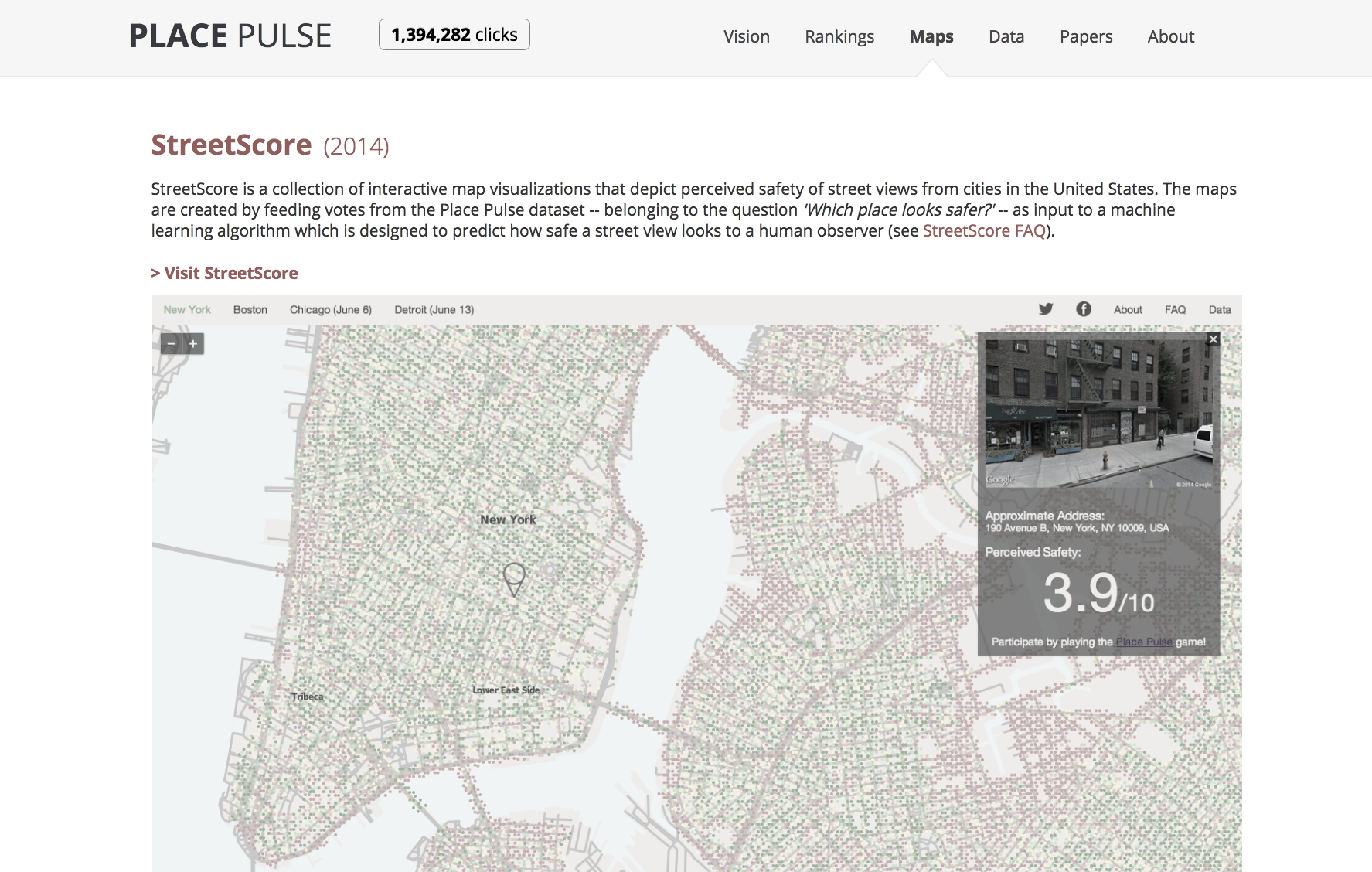
Streetscore (2014) is a computer vision algorithm that estimates people's perception of urban environments. We have used Streetscore to create high resolution maps of urban perception with the goal of studying the social impact of urban perception, and also, to study urban change.
Streetscore was created together with Nikhil Naik. The Streetscore website was created together with Nikhil Naik and Jade Philipoom.
DIVE (2017) is a data integration and visualization engine that allows users to transform data into stories, by facilitating visualizations through recommendations, and providing an statistical tool including multivariate statistics. DIVE was created by Kevin Hu, as part of his Masters and PhD work at the Collective Learning group at the MIT Media Lab (paper)
OpenTeams (2018) is an open source platform to visualize team data. It is designed for email metadata, and also, includes validated surveys regarding personality (big five) and morals (moral foundation). You can access OpenTeams.